Saturday, March 26, 2011

Top of the World


When I look back on my life so far, it seems my destiny was to end up in the mountains. I grew up looking out my bedroom window at the mountain range where I would eventually live. Our house was on Mountain View Drive and I went to Top of the World Elementary. And that's the kicker in the odd synchronicity of these things. Little did I know that one day I would climb a mountain and stand on what felt like the top of the world to me.

Once you reach Trail Crest, you've gained most of the elevation on your way to the summit of Mt. Whitney. At 13,600 feet, you find yourself on a knife-edge ridge, where you can see forever. Valleys give way to ridges that march off into the distance, growing bluer and paler, eventually melting into the sky. It brings new meaning to bird's eye view. I had never been that high—on the ground, without pharmaceutical aids—in my life. I wanted to soar out over the ridges and valleys as I have in my dreams so many times.

Last weekend, it snowed like crazy. We were supposed to go camping, but due to the storm coming in, we cancelled. We had planned to go to the campground where we stayed the night before we began the hike up Whitney. It's my favorite place to camp and I was looking forward to seeing the eastern Sierra ridge and Whitney once again.

I was extremely disappointed, my moping increased as the weather outlook got nastier. So, since I couldn't visit my mountains, I painted them instead.

Top of the World I, Top of the World II
Panorama Set
8" X 8", Acrylic on Canvas

Thursday, March 17, 2011

Cyclamen Dance


The dance is complete. With a sigh of satisfaction I signed this piece, which flowed from the first delicate pencil lines to the last brushstroke. Rendering the color, the pattern, the texture, was as satisfying as great sex, a wonderful meal, the sincere and deep hug from a small child you've just met. It felt so good to have a success after the frustration of the last piece.

Here is the weird thing though—or maybe not—yesterday when I was working out, I found myself looking at the creek painting once again, which had remained sitting in the living room, festering quietly. Forlornly propped against the television cabinet, I had ignored it for days. I think I even swiffered around it a few days ago, gathering up the dust bunny frame. That's how immune I'd become to its presence.

Now that my head has cleared, washed clean by watercolor, I noticed it once again. It may not be such a bad painting after all. Sure, it needs some work, but it isn’t the train wreck I thought it was. I'm going to take it back to the studio and see what happens.


Cyclamen Dance
12" X 16", Watercolor

Thursday, March 10, 2011

Back in the Saddle


I'm working on a new painting and I’m loving it.

It's a dance across a giant ballroom in a twirly gown. If there were a crowd, they'd be clapping at the grace and beauty of my execution. I’d probably be wearing a tiara. I know that sounds overly dramatic and well, kind of like I’m a swellhead, but I’m really happy and excited about what I’ve done so far. I’m intoxicated with the joy of a painting that's going well.

I know I risk great exposure here, telling you about it. What if this painting doesn’t work out as it progresses? What if I catch a heel in my skirt and fly a$$ over teakettle, my tiara skittering across the floor, spattering rhinestones in its wake? Oh well, that’s the risk I take. I live for danger, you know.

Recently, I realized that I went down the wrong path with the creek painting. Even before I started it, I had a strong urge to work with watercolor. Yet, I ignored that tug toward watercolor—and that's what started the entire mess.

Let's see if I can describe this. There are times when I approach my next art project from a sensual perspective. I think about the various media (rather than a specific subject) and how I experience each with my senses.

It might be the interplay of a soft brush whispering across paper, sweeping along the magic-magnetic tension of watercolor. Perhaps it is the crunch of a stiff brush dabbing at a canvas bouncing back in response. It could be the purity of transparent color I want, or the opacity of acrylic textured by brush strokes. Thin, thick—or a contrast of both? Do I want color granulating into the mottled crevices of paper? Shall I let the woven canvas shine through, or cover the surface in a thick impasto?

Is it the musty scent of sizing released by watercolor paper when it's wet (the more expensive the sheet, the smellier!), or the scentless sterility of a canvas board? Shall I immerse myself in the medium; spatter ink on my face, smear chalk on my forearms, or just tickle the surface with a delicate drawing?

And so, I realized I had to feed the need to explore again with watercolor. I started a painting of a cyclamen in bloom, (using one of my very special pieces of watercolor paper given to me by my sweet husband). I love the inside-out flowers—like wings fluttering above the leaves. I love the graceful forms, the brilliant color.

It was just what I needed. Ahhh, I feel so much better.

Tuesday, March 1, 2011

A Love Affair Gone Very Wrong

I've been thinking about water for more than a week now. Cool, burbling, gold-glinted amber water swirling around the stones it softened on its way by. Bugs skitter and damselflies dab and lift across the surface, while fat trout kiss the underside and dart back into green shadows. Strands of algae along the banks undulate, stretching downstream with the current. There is the comforting river-smell of organic matter melting and returning to the earth.

I'm working on a painting of a crossing we made over Lone Pine Creek. It's been torturous.

Sometimes a painting is a joyous flow of creativity—a love affair. Other times, not so much. The love's long gone out of this one.

I started the piece last weekend, enjoying some time in the studio while snow fluttered throughout the afternoon. I was deep in remembrance of the spot; in love with the transparency of the color and the juicy emerald shadows framing the creek. The rocks felt right; the foliage natural and loose. I captured the glinting flow in golds and oranges and tinted ochre.

Then I took it too far, going overboard with colors that turned the piece into a ghastly nightmare. My lovely creek became an old whore in cracked make up.

Yet, I continued to work on it. I was the bleary-eyed truck driver on a hairy road in the rain who should really stop to rest, but doesn't. Things started to go über bad. Cover-it-up bad. Make-me-give-up-on-the-subject bad.

I tempered the garish color, repainting and redefining elements in the process. It was getting late. Dinner was going to be way late. I took the painting to the living room viewing area to assess the damage. It was clunky, awkward, tight, and contrived.

A week went by while I looked and thought about it. I thought about it lot. The amber water was in my dreams. I resisted the urge to start a new painting and returned to the scene of the art crime.

With time and a fresh eye, I discovered the rocks appeared to be sitting on the water rather than resting in it. The foreground, bulbous blobs; the background a demented and haunted forest. But, I thought there was hope.

After several hours, I had painted myself back into an ugly corner. The painting was stilted and overworked; tired as a postal worker.

I painted over most of it, moving and removing elements. This was the third time. I dove in one more time. But, the day wore away and it was not getting any better. I had to start dinner (please, not so late tonight, sweetie?).

I was tremendously annoyed and discouraged. I wanted to snap it in half and throw the pieces out the window, screaming across the canyon in frustration.

No. Let it rest, Susan. Give it some space.

I think what is most maddening is when I spend hours on a piece that never comes to fruition. Too me, it is a colossal waste of time—like sleeping all day—a wicked, wicked waste of my precious little painting time. Although the reality is that even the failures are part of the art journey. It all counts, whether there is a piece in the end or not.

We'll see how this one plays out.

Saturday, February 19, 2011

For Fran, Part One*

Although I'm in my "Whitney Phase", over the years I've completed several paintings of Wrightwood. And how could I not? I'm so lucky to be surrounded by such an inspiring landscape.

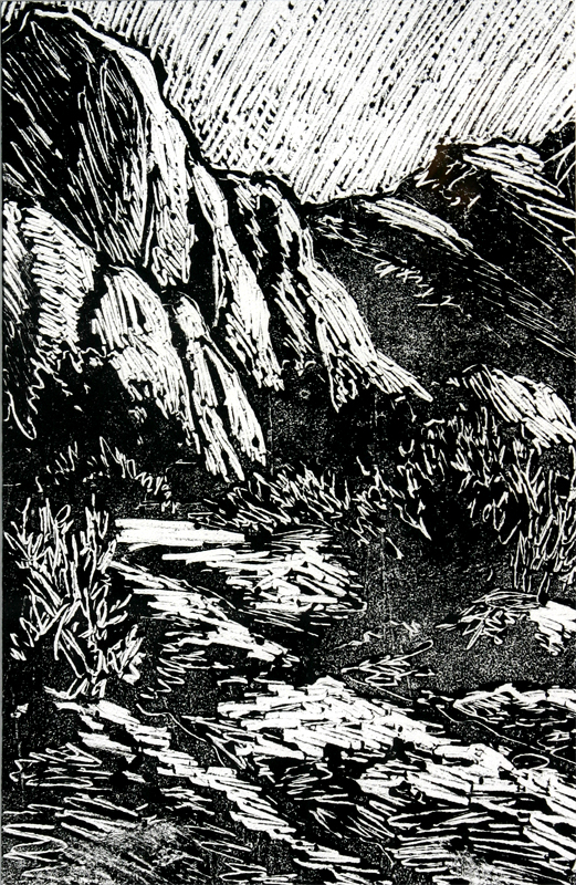
The Mormon Rocks along Highway 138 have been a recurring theme in my work. I think of them as the guardians of Wrightwood. Once they are in sight, I know I'm almost home. And each time I see them, they look different: pink with the first light of the sun, chocolate-brown from the rain, kissed by blue snow, or radiant-gold at day's end. I never get tired of looking at them or drawing and painting them.


Mormon Rocks, Tall

9" X 12". Monoprint.

Lately I've been playing around with printmaking again. A few months ago, I tried a new method where I inked a metal plate, and "drew" an image using the end of a paintbrush to scribe and scrape away the ink. The result is very similar to a wood or linoleum block print. However, with this method, you get only one print. Each image is unique. The paper absorbs most of the ink, so there is not enough left behind to get another. You can see that in the images. There are spots where the ink coverage is thinner.

I use an oil-based ink, which I extend a bit with some oily goo I found in a paint box that was passed on to me. I don't know what it is, but it sure works well to give the ink the right viscosity. The only downside to this technique is that I get ink all over everything—especially my face. My hands and nails are black for days.


Mormon Rocks

12" X 9". Monotype.

This piece uses the same process, except that after the print dries, I add color with Prismacolor pencils. That's why it's called a monotype—because it has been embellished in some way. I love the effect of adding color and the cool thing about Prismacolor pencil is the waxy quality of the material makes it show up when layered over the black ink.

I've really enjoyed this process—the near immediate gratification (if I've done the drawing well)—and the tactile aspect of it too. Yes, I rather enjoy getting dirty in the process. You'll see more of this type of print in the coming months.

S

* Fran wanted to see some Wrightwood art. Here you go, sweetie!


Monday, February 14, 2011

Repetition is Good for the Soul

With some images, I find them coming back to me—in my head, that is. I keep thinking about them and imagine how they might appear in different media. I think about the feel of the medium. Watercolor across a light pencil drawing, color pooling in the blue shadows. The roughness of pastel, the carved ruggedness of a relief print. I might be washing dishes, or sitting in a meeting, or just daydreaming when the image returns to center stage in my thoughts.

I think it's because I haven't said all there is to say about a subject. The art hasn't finished spilling out of me. I'm not finished reflecting the impression it made. The image of Trail Camp at sunrise is one of those subjects. And so, I decided to explore it again with pastel.

Pastel has an energy and a texture that was just what I needed to capture the shattered planes of color in the jagged rocks; I wanted loose strokes on rough paper. I wanted that gritty brilliance and glow.

As I worked, I remembered…

The second morning we were at Trail Camp, we were tired and dehydrated, but still riding high from reaching the summit of Mt. Whitney the day before. We sipped our tea to warm us while waiting for the sun to tip over the ridge. We had just started to repack our backpacks for the trip back down to Whitney Portal. It was cold, but the ridge looked like fire.

I kept looking at the ridge, wanting to burn it into my brain, knowing I'd never be back.

Trail Camp at Sunrise
Pastel on Paper. 9" X 12".

Thursday, February 10, 2011

Overhead Companion

The day before we tackled Mt. Whitney, we hiked up the trail to Little Meysan Lake. Our goal was to get in a little elevation and get the muscles moving. We felt sluggish. Inside, I was panicking. The next day was only the event of my lifetime, and here I was huffing and puffing and feeling achy. Yet our surroundings were so breathtaking, that eventually we all fell into a rhythm and began to enjoy the climb up the trail. You could see the cirque that held the lake above us, and to the southeast, we looked out over a deep canyon.

Although we had a blue sky when we started, clouds were starting to gather. You could see the winds swirling and pulling tendrils from the clouds, eventually pushing them up against the ridge where they darkened. Was it going to rain? Maybe snow? I stopped to look up at the sky and saw this hawk circling above us. He had joined the party and accompanied us for a while on our journey. It seemed to portend good things.

As we climbed, the clouds continued to thicken. When we stopped for lunch, the breeze kicked up and out came the jackets—even ahead of our lunches. Fat drops landed here and there—just enough to make it fun—but also enough that we decided to head back after our lunch in case the rain got serious. It never did and neither did we. It was a great day.

Acrylic on Canvas 18" X 24"

Tuesday, February 8, 2011

What Happened Next

Over the weekend, I returned to The Experiment. With sharpened tools, I tackled the carving on the remaining part of the plate. Even with sharper tools, it is a tedious process; and, it's difficult to tell if you have carved away enough of the material to get a clean result.


The unpredictable process of making a relief print lends a rustic, roughened look to the work. Well, unless you are really skilled and patient and anal, all of which, I am not. I've seen some amazing relief prints that look more like fine etchings—none of them mine.

However, I like the crudeness that it brings to the drawing. It makes the piece wildly free and surprising; a happy accident that adds a new dimension to the subject.

Once the plate is prepared, the real work begins as you search for the magical balance of ink and moisture. It's extremely rare that the first print works, since the process requires a little warm up as you balance the variables.

How do I actually make the prints? First, the paper is dampened and left to dry a bit. Meanwhile, the plate is inked with a brayer. I like to mix a bit of red into my black ink. It becomes a rich, wet-earth, sepia-like color. It was tricky inking just the raised surface and not the background.

Next, I lay the plate on my press, cover the plate with the sheet of paper, and run 'er through. One must be careful to not get whacked by the spinning handles of the press as the rollers pass over the plate. The print is carefully pulled away from the plate and set aside to dry.

Here you can see a several prints on different papers with varying degrees of moisture. I tried a coarse paper that looks like rolled oatmeal, another that has pieces of straw in it, one that is akin to papyrus, and a fine printmaking paper that I pre-painted with acrylic.

The water-based inks run terribly if the paper is too wet. I ended up with prints that looked like Tammy Faye Baker's face, mascara running down her cheeks with little tentacles branching off into the folds and wrinkles of her skin. Not attractive. I backed off on the water and found that if I let the sheet dry more, I got the best results.

I also tried some dry sheets with varying degrees of success. The ink didn't run, but in some cases, the image is not as solid.


After a few practice runs, I tried the pre-painted sheets—one of which came out pretty well. I like the way the softened paper was embossed by the plate. I may take some of the "duds" and add some other materials—paint, pastel, or pencil—to see if I can turn them into winners.

So now that you've seen how I make relief prints, you'll know when you see three or four prints of the same subject at my show, it's not a production-line process. Each one is unique and there are far more that end up in the trash than are framed. But that's what makes it fun.

Friday, February 4, 2011

The Experiment

I find more frequently that I tend to explore subjects in more than one medium. I might paint the same subject in acrylic, then pastel, or create a relief print. Each medium lends a different feel to the subject.

As I was working on the painting of the tree and the hawk in the sky, an idea started to take shape—what if I combined painting and relief printing?

Let's find out together. I'm going to share this experiment with you. You'll see it progress in stages and along the way, we'll find out together if this works or whether the pieces get tossed into the collage folder.

To begin with, I've taken three sheets of printmaking paper and painted them with a mix of "sky" colors using acrylic. Loose, free, splattery.

Then, I drew the image of the tree onto a piece of linoleum. Since I must cut away all but the tree, my forms need to be a bit simpler than they would be with a drawing or painting.

Here you can see I've started cutting away the linoleum. My tools were dull, and although my sweet husband offered to sharpen them for me sometime in the unspecified future (no, I want them NOW), I could not wait and elected to work with them anyway. Interesting how I struggled to remove the material, yet quite effectively cut myself. However, after a time, I developed a rhythm that worked well enough to reduce the cursing (yes, mine) to a nominal level.

Once I complete carving away the background, I will ink the plate and print over the pre-painted paper. Then, I may—or may not—embellish the clouds with paint or something else. We'll see…

Every print is an adventure. There are so many variables that can affect the success. Is the paper wet enough? Do I have enough ink on the plate? Is it even? Will I smear or rip it when I take it off the plate?

I can sense your growing anticipation over the next step of this experiment. I'm getting excited just telling you about it. Stay tuned, and I'll keep you posted on the progress.

S

Monday, January 31, 2011

Stuff That's Simmering

When pieces are in the Not Quite Ready for Sharing category, they sit in the living room where we can walk by them a throughout the day and evening. They are also positioned so that when I work out, I can study them. It's a little like letting the turkey rest when you take it out of the oven, except that you can put the painting back into the oven, so to speak, if it's not quite done.

Sometimes, after a few days, a glaringly obvious problem will appear. If that doesn't happen, I'll turn the piece upside down to see if I missed anything. At some point, the piece returns to the studio for rework or a coat of varnish.


This is one of the pieces I brought down from the studio. What you don't see in this earlier version is the addition of a hawk. The hawk is critical to this painting and it took quite a bit of the time to add it. It could be the crowning touch or the reason I cover the painting over with whatever is left on my palette to begin again. Adding elements like the hawk can destroy a painting, taking it from a wonderful expression to a smaltzy piece of crap—like adding the teardrop to the kitten with the big eyes (not that there is any hope of wonderful expression in that example).

So, it sits and we debate, "Does the hawk work or does it look stupid?" The consensus this morning is that it works, but needs a minor tweak or two. I need to think about how I'm going to tackle that for a few days though.

Trickster spent many days, two or three times in the Viewing Area. I looked and looked at this painting. This fellow did not want me to capture his likeness. I struggled and repainted parts of him several times. It's funny that I did not give up and wipe him away. I guess I wanted to beat the trickster and show him that I could capture his likeness. He now lives with our friend Bob, so he's not too far away.

Have you ever struggled with something long after you would have normally given up? What do you think prompted you to go on?