Showing posts with label California. Show all posts

Sunday, February 9, 2025

Catching Up - Part 3


Manter Creek
8” x 10”
Multicolor Relief Print

Several years ago, we went on a backpack trip into the Domeland Wilderness in California. It is a remote, little-known wilderness that burned about 10 years before our trip. This resulted in an incredible landscape with patches of standing and fallen burnt trees intermingled with baby trees that sprouted after the fire, as well as tremendously large trees the fire left behind. The trail was challenging. We had to climb over and crawl under more trees than we could count.

We camped on Manter Creek, an oasis surrounded by land that had mostly burned. The cool of the creek in the heat of September was a delight at the end of each day. The nights were surprisingly cool, so the campfire was a welcome addition to our circle of friends.

Over the four-day trip, we only saw two people and a couple of rattlesnakes. One night, a pack of coyotes ran through our camp yipping like wild teenagers whose parents were out of town.


Here is the piece with only three color plates completed.
 

It was the wildest and most beautiful place I’ve ever been. I created several paintings and monoprints from this trip. The idea for this piece is taken from one of those paintings. Having a familiar subject allowed me to explore technique and color in the process of creating the prints.


Wild Iris
8” x 10”
Multicolor Relief Print

I love Wild Iris. It was rare to see them in the San Gabriel Mountains of California. But here in Colorado, there are fields of them in early summer. Especially after a wet winter. It’s truly incredible.

This piece was also taken from a watercolor painting I did of an Iris that was a delightful surprise on a trail we hiked frequently. It was a “reward” after climbing a fairly steep hill that was deeper into the hike. You know, past the point where the casual hikers wearing tennies and carrying a 12 oz. bottle of water give up on “hiking”?
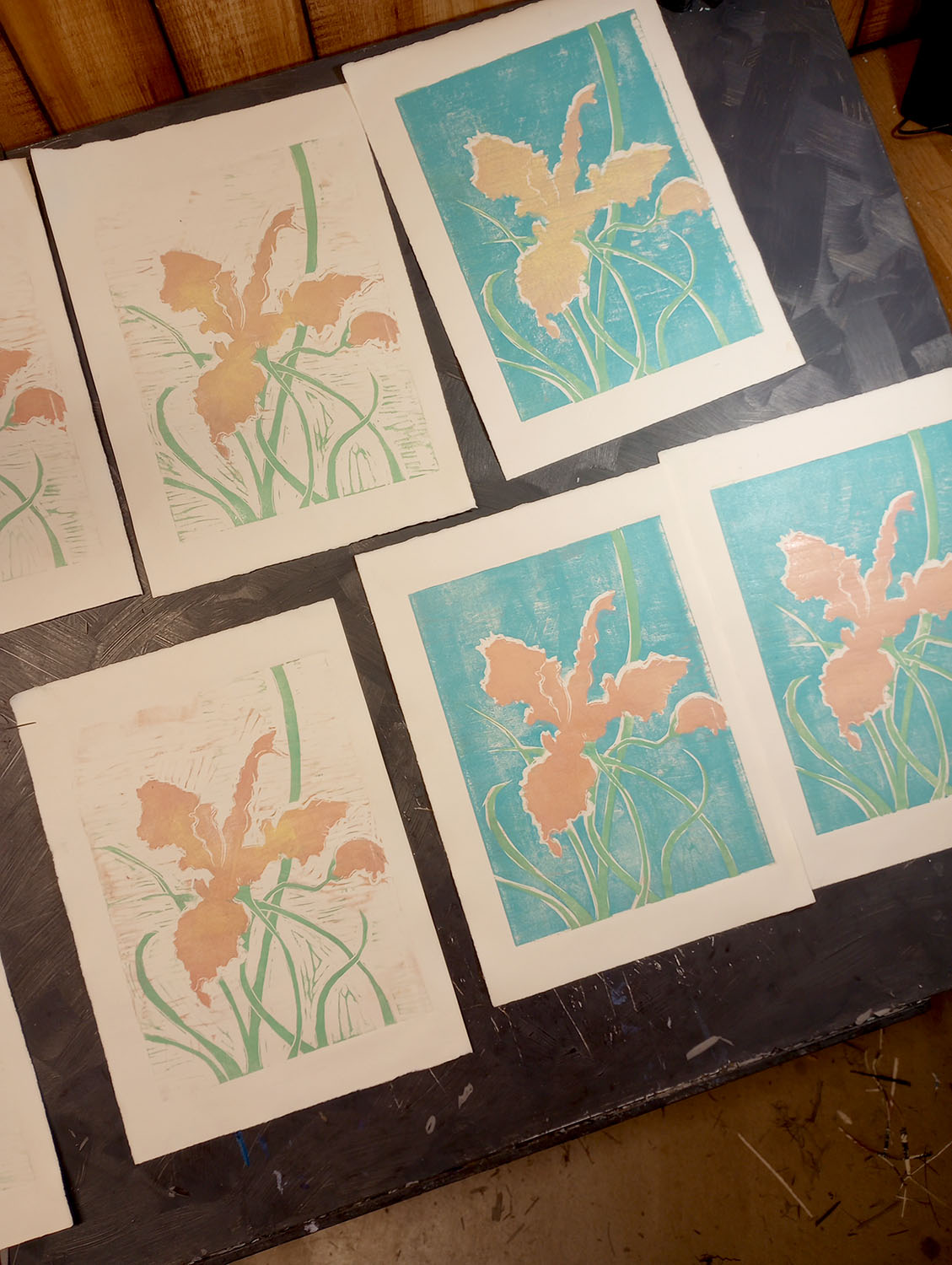
 
Here, you can see the partially completed prints.

Something unique about this piece is that I mixed the plate colors in such a sequence that I didn't have to wash my inking surface between colors. I went from pale yellow to coral, then pink, on to green, blue, and then black. This created color harmony as each succeeding color had a little of the previous color in it.

Thursday, May 1, 2014

Variations on a Theme


Sycamore Shade I
Mixed Media Monotype
9" X 12"

I recently started a painting of California Sycamores and found myself bored with the process and the painting. The piece may be salvageable, but only if I can overcome the disenchantment brought on by the dib-dab-dobbingly monotonous foliage that makes me yawn even as I describe it. The subject was interesting enough, but my execution was uninspired. I decided it was time to return to making monotypes to revive my enthusiasm.

Each time I return to monoprinting, it’s a fresh challenge. Should I wet the paper? Does the image transfer better with acrylic, watercolor, or oil paint? What brush did I use last time to scrape away the ink? If I recorded this information and kept better track of my tools, this would be a simple process. However, I confess I enjoy finding my way through the process each time in the hope that I will uncover some new technique that delights me.

Sycamore Shade II
Mixed Media Monotype
9" X 12"

I created two prints using slightly different techniques. With the first, I did a rough drawing (with paint) on a Plexiglas sheet. I brushed in the background colors of the leaves lit by the sun. Then, I added some blues and grays to establish the trees. This build-up of color took several repetitions as I applied paint to the plate, flipped the paper on top, and burnished the back of the sheet to transfer the paint.

Then I broke out black and gray oil colors to overprint the lighter tones. I rolled the ink onto the plate with a brayer and set to scraping away ink. I was working blindly as I'd completely covered the ghost image that remained on the plate. It was kind of a "duh" moment, but I went with it anyway, guessing where the trees were and scraping accordingly.

When I peeled the paper away after the last rubbing, I really liked the texture of the ink contrasting against the layers of color. I added a bit more color here and there and voila! I hope you like it too.

With the second piece, I took the reverse approach: First, I inked the plate with a mix of black and gray. I scraped away the background, then brushed out the highlights on the tree trucks. After I transferred the ink to paper, I added layers of color on top – giving me a different result: more structured than the first piece. I like them both—how about you?

I love experimenting with the layering and lifting of ink and paint—this was just what I needed to break out of the doldrums of my recent art (non) adventures.